Vention
Conversion-optimized landing page for a custom software development company
CRO Design | Content Design
Conversion Rate Optimization.
Visual Design.
Content Design.
Competitor Research.
Conversion Rate Optimization. Visual Design. Content Design. Competitor Research.
Overview
As a Conversion Rate Optimization Designer at Gartner, I designed conversion-optimized landing pages providing an overview of the solutions offered by B2B software companies. The main purpose of these landing pages was to capture user information to connect them with the client’s sales teams for a free demo or trial of the software.
Problem
Vention is a B2B company providing custom software development services looking to acquire relevant leads and new customers. The company was using its website as its landing page in Gartner’s PPC program but wanted a more concise, optimized page to help with lead capture efforts.
I conducted an analysis of high-converting landing pages and websites in the custom software development category, observing the trends present. I also analyzed the client’s personal website to get an idea of their brand tone as well as colors, fonts and images so that the new landing page is an accurate reflection of the company. With this data, I created a conversion-focused landing page using UX writing to highlight their main product offerings and benefits for users while adhering to our team’s best practices. After 3 months of using their new landing page, Vention saw a 35% increase in their conversion rates from when they were using their website.
Solution
Role
CRO/Lead Designer
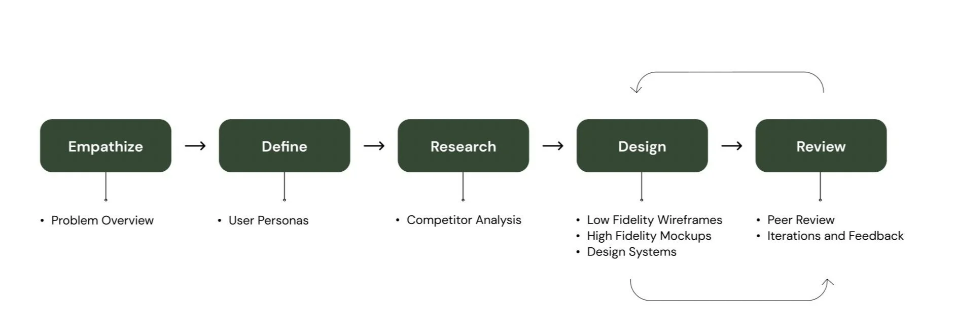
My Process
Project Type
Landing Page Design
Tools
Instapage
Adobe Illustrator
Figma
Monday.com
Project Background
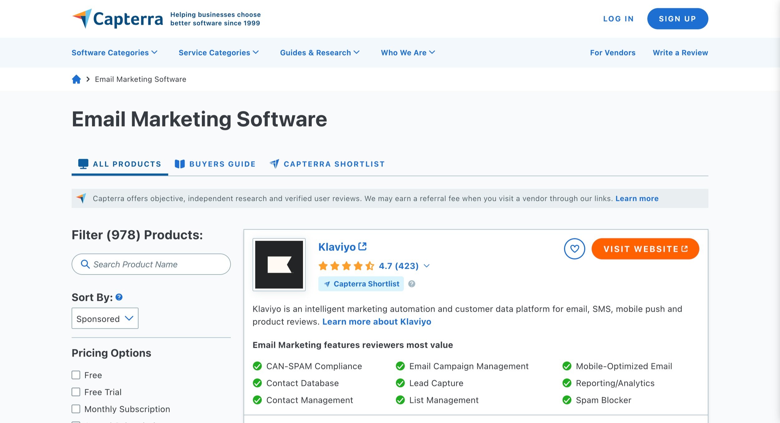
Capterra, one of Gartner Digital Markets’ products, is a marketplace for software buyers to review and purchase different software products in various categories (for example, Human Resources Management or Tax Software Management). Capterra provides a one-stop shop for buyers to view and opt-in to free trial or demos of software products they are interested in. As a CRO Designer, I created landing pages for companies’ whose products were displayed on Capterra’s marketplace and to help increase sign-up rates of new customers.
User Personas
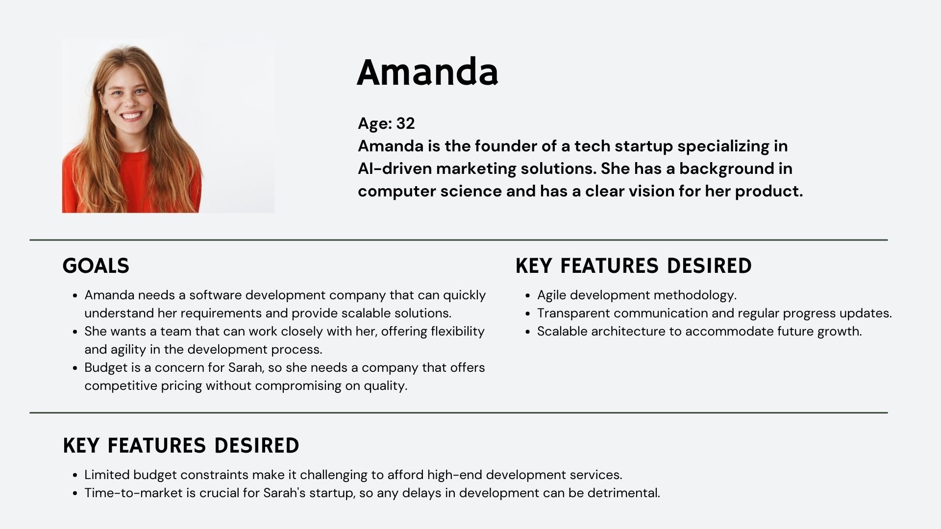
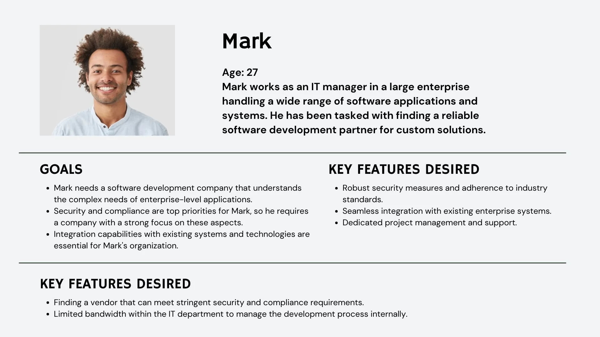
The target users for this landing page are individuals looking for custom software development services on behalf of their small businesses. Users coming across the landing page have varying levels of expertise with the software so it’s important to take that into account when creating the copy for the landing pages. For this landing page, I focused on two users: Amanda and John.
Research
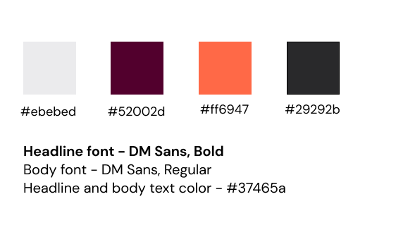
Before beginning the design process, I did some research about the best performing landing pages in the custom software development category and analyzed what they had in common to determine what elements I should include in the new landing page. The client also provided their brand guide which included their brand colors, fonts, icons and brand tone.
Sample of client’s brand guide
Competitor analysis
From the competitor analysis performed on other websites in the custom software development category, the following trends were identified:
Benefits-focused: High-converting landing pages use concise, benefit-oriented headlines that immediately convey the page's purpose and value to the user.
Value Proposition: Articulating a strong value proposition in the opening and closing sections of the page explains what makes your product or service unique and why users should care.
Highlighting trust elements: Including 1-2 positive experiences with the product helps buyers visualize how the product could help in solving their problems. This could be in the form of user reviews, mentioning other companies who have used the product, or including relevant badges and awards.
High-contrast CTA: Overall, the pages had an intuitive user flow to help buyers through their journey with the intended outcome of providing their information for a sales quote or product demo. Using a high-contrast CTA keeps the buyer’s attention focused on the specific action they are supposed to take.
Design
After reviewing the client’s brand guide, I was ready to design the client’s new landing page, following our best practices and insights from high-converting landing pages in the custom software development category.
I created a basic wireframe to arrange where the different sections of the page would go. For the copy, I used a combination of the information provided by the client in their intake form and public-facing information from their website, ensuring accurate information about the software is provided. The tone was personable yet professional to ensure it matched the client’s brand voice.
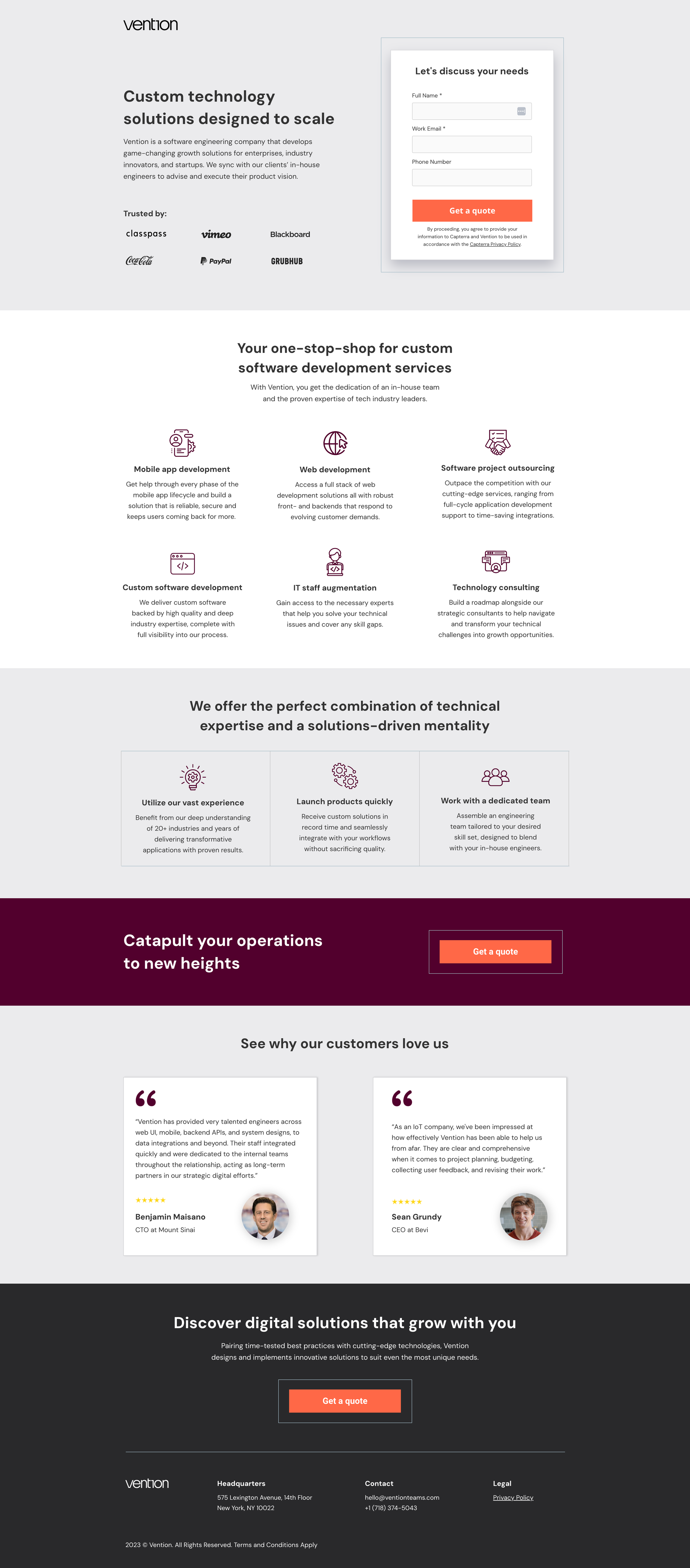
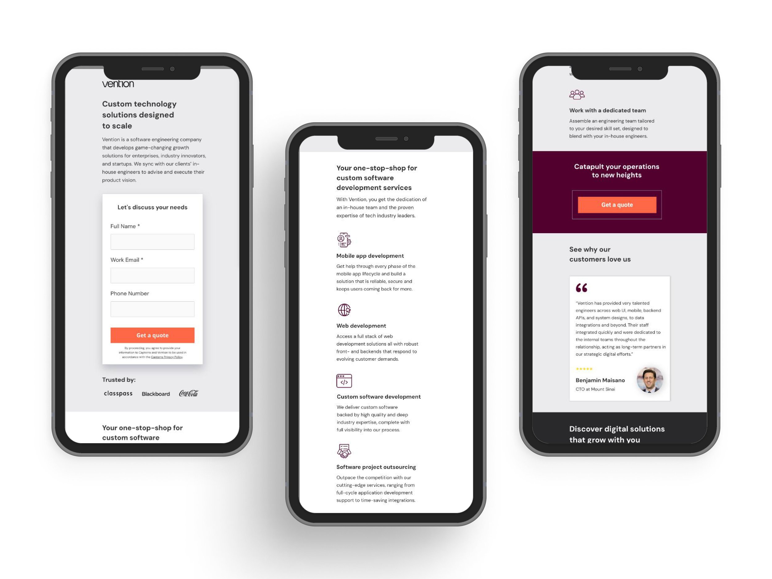
Benefits sectionTo highlight the benefits of Vention’s software, I used verbs in the active voice to keep the focus on how the buyers’ needs will be met with this software.
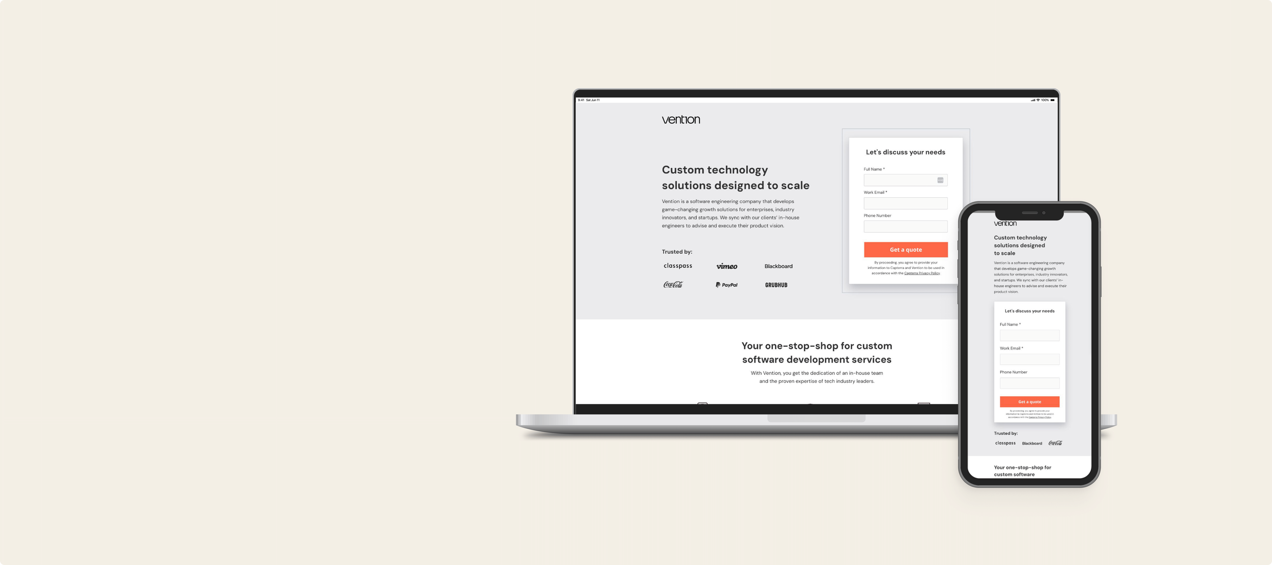
Above-the-fold sectionA descriptive but concise headline and sub-headline captures users attention immediately and draws them into the rest of the page.
Forms are kept very simple with only 3-5 form fields to get the basic information required to follow up with leads and to keep the overall page length concise.
Spotlighting the companies that use Vention acts as a trust element and is another way to gain buyer’s trust.
Customer reviews Customer reviews are another important trust element to give buyer’s insight into the experiences of real users like themselves.
The landing page went through two rounds of reviews.
The first review is an internal peer review process where another member of our design team critiques the page and makes any suggestions they have. The goal of this review is to act as a second set of eyes before the page gets sent to the client.
After the changes are made from the first review, the page is then sent to the client and they get a chance to send over corrections before the final version of the page is published. We’re happy when the client is happy and satisfied with the representation of their brand and product(s).
Around 50% of Capterra users access the platform via their mobile phone so it’s essential that all the landing pages are optimized for mobile viewing in addition to desktop. To reduce clutter, the number of certain elements are reduced. For example, only one review is highlighted in the mobile version instead of two and the number of company logos in the above-the-fold section was reduced from 6 to 3. Additionally, all the text has been left aligned to make the page easier to scan.
FeaturesThe features section is one of the main focal points of the landing page, set apart using a white background. Succinct descriptions of the software’s selling points gives the buyers a high-level overview of the product without alienating users not savvy with this software.
CTAUsing a high contrast CTA button across the page immediately directs users to the main action required, and improves the overall user experience.
Impactful closing sectionThe closing section reminds the user about Vention’s value proposition and gives the user one last opportunity to provide their information.
Iteration & feedback
Optimized for mobile