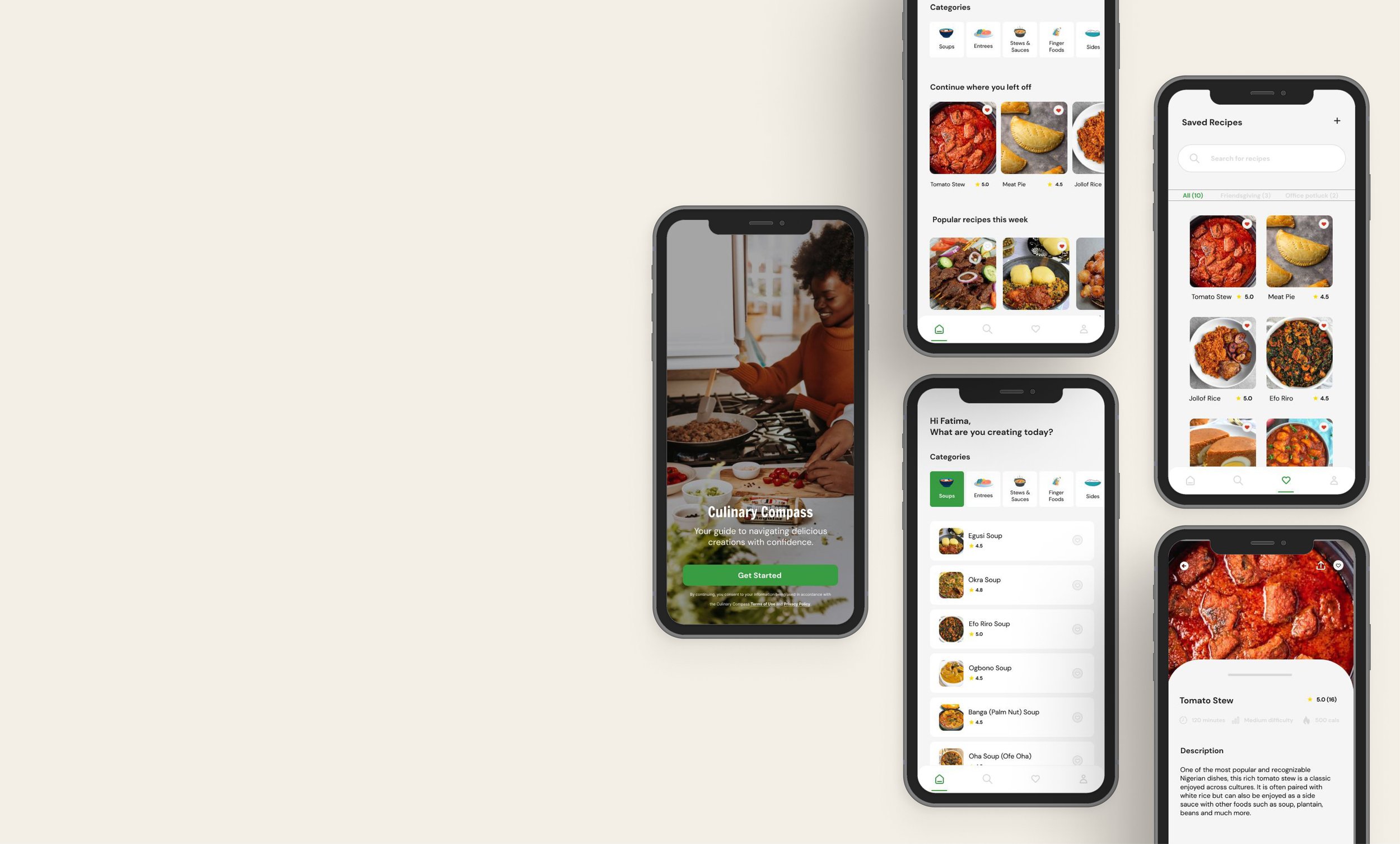
Culinary Compass
A mobile app for accessing Nigerian food recipes
UX Design.
Content Design.
Visual Design.
UX Design. Content Design. Visual Design.
Problem Overview
People interested in Nigerian cuisine, particularly those with busy lifestyles or limited cooking experience, face challenges in preparing traditional Nigerian meals due to factors such as unfamiliarity with recipes, lack of time for meal planning, and difficulty in sourcing ingredients. Despite the rich culinary heritage of Nigeria, there is a gap in accessible and user-friendly resources that cater to the diverse needs and preferences of modern users.
Solution
Role
Lead UX Designer
Culinary Compass offers convenient access to authentic recipes, ingredient sourcing assistance, and educational content to empower users to confidently and efficiently prepare delicious Nigerian meals in their homes. Users can search and access recipes, create and save collections, share their meals with friends, and leave reviews.
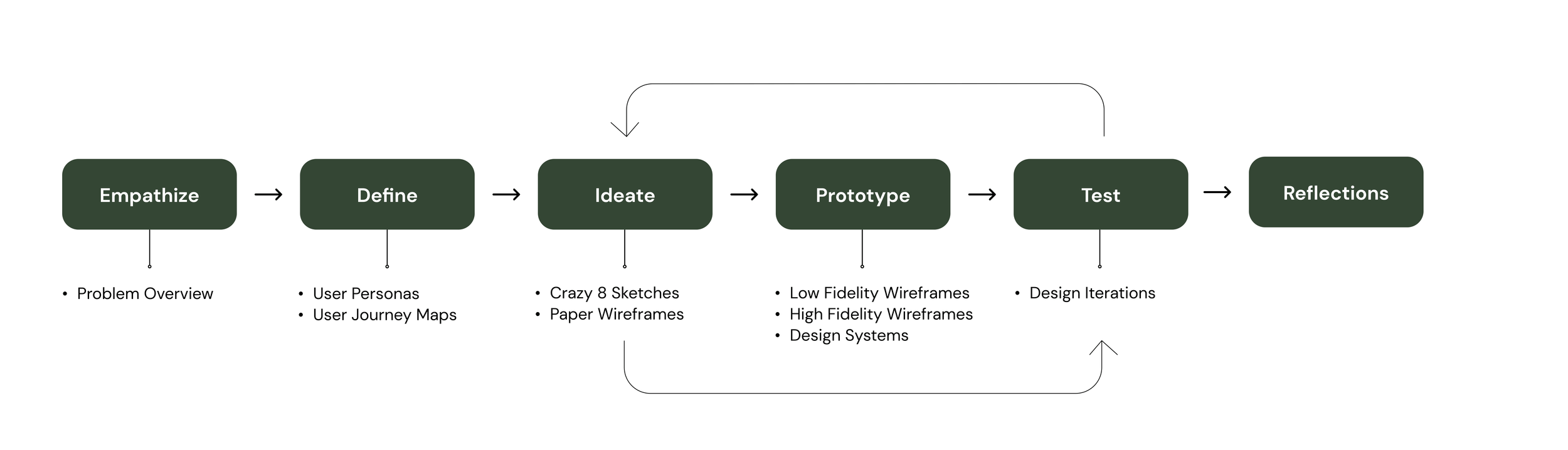
Process
Project Type
Mobile App Design
Tools
Figma
Canva
User Personas
As a young Nigerian living in the diaspora, I’ve often turned to food for comfort when feeling homesick. Learning to cook my favourites food became a labor of love and resulting from wanting to save money and I imagined a central, easy-to-access place where I could easily access new and old recipes.
This user persona, Fatima, represents the ideal user for this app.
User Journey Map
Ideating Design Solutions
Based on what I knew about the users, I identified the following pain points and user problems:
One central place to access and search for recipes
User-friendly language so the platform is accessible to chefs of all cooking levels
Ability to share feedback and information about the recipes with other users
I used the “Crazy 8” technique to quickly sketch out possible ideas and solutions to the user problems I had identified. This exercise helped me get creative about what the app would look like and what kind of features it could include to target the users’ needs.
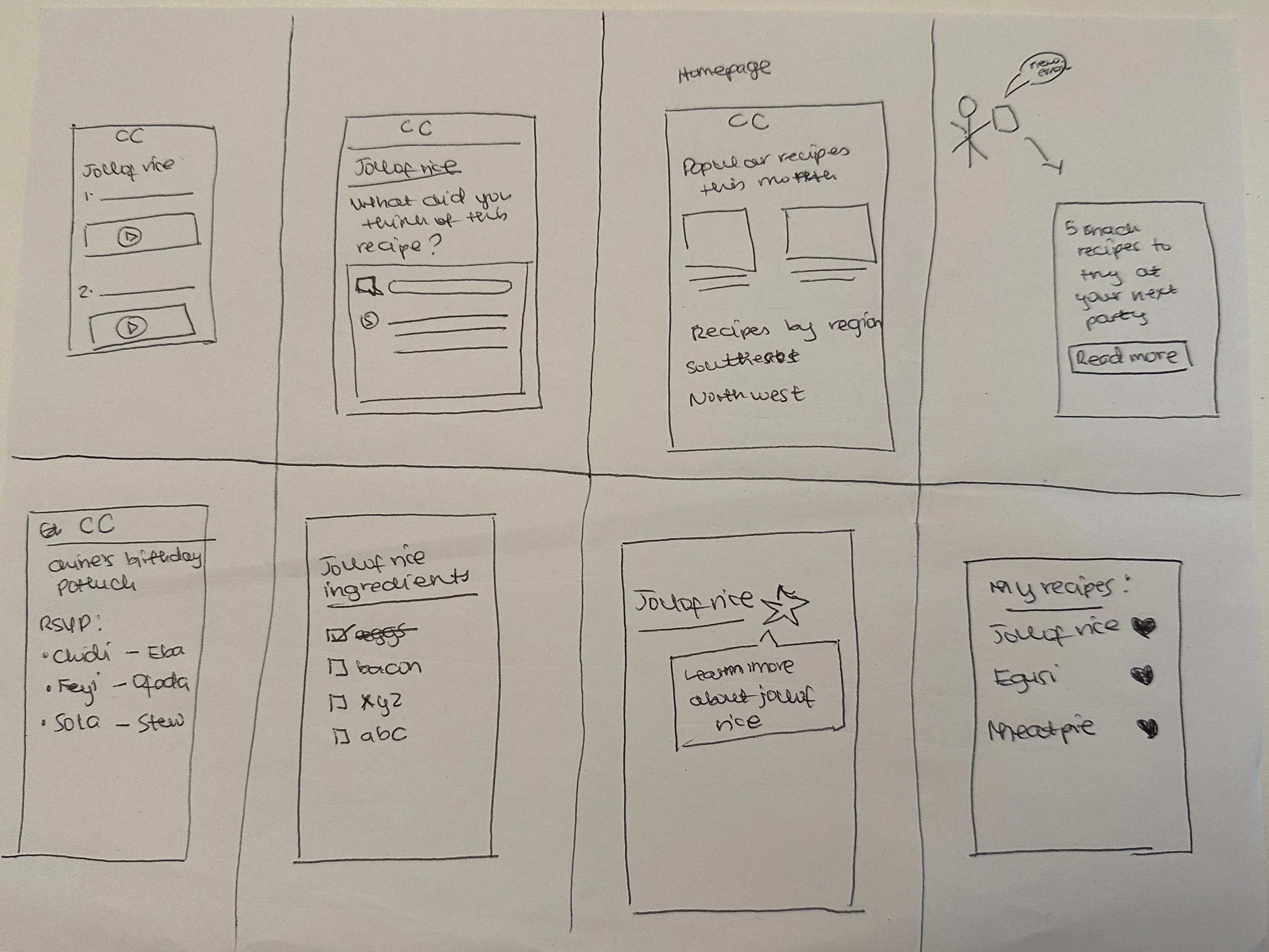
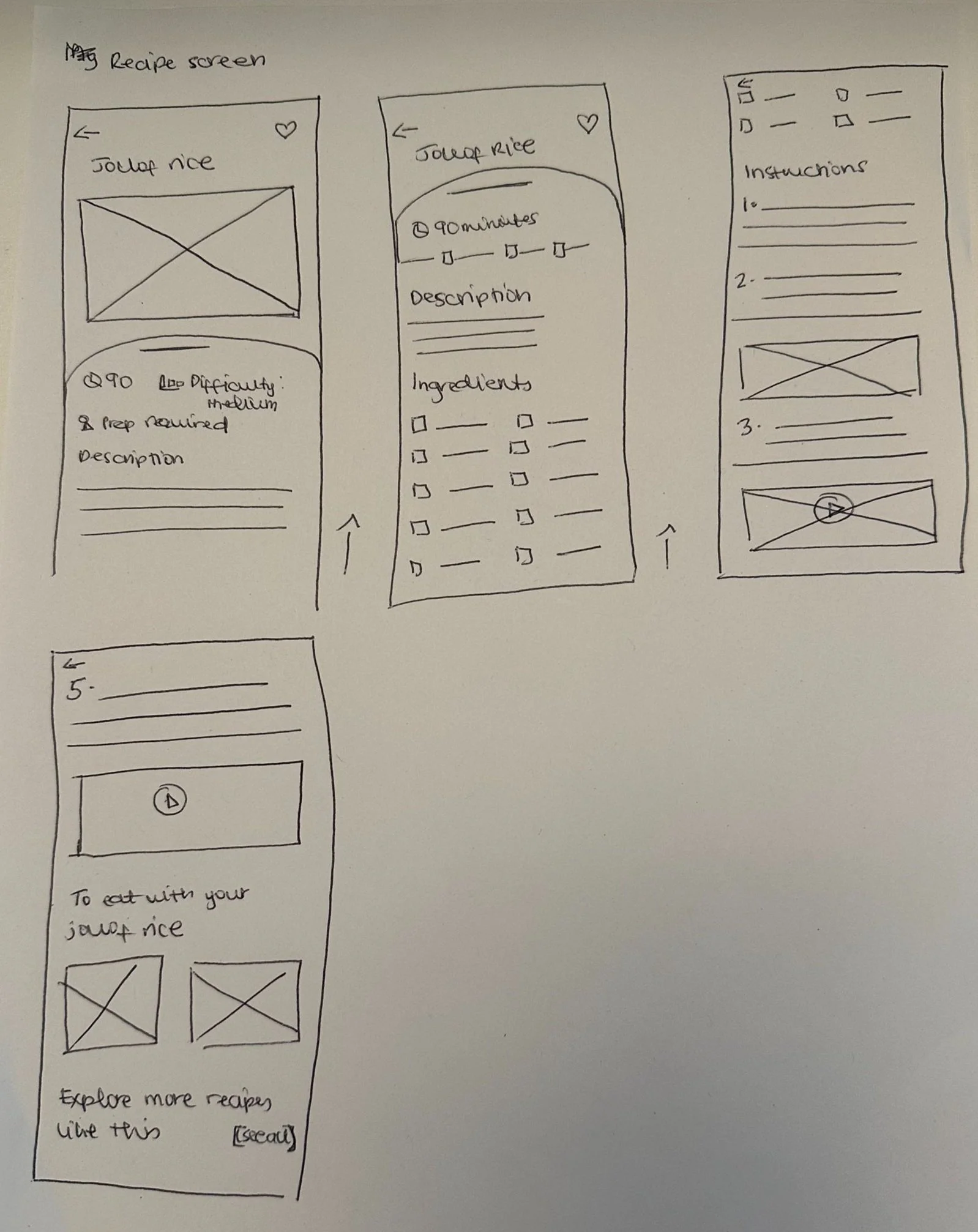
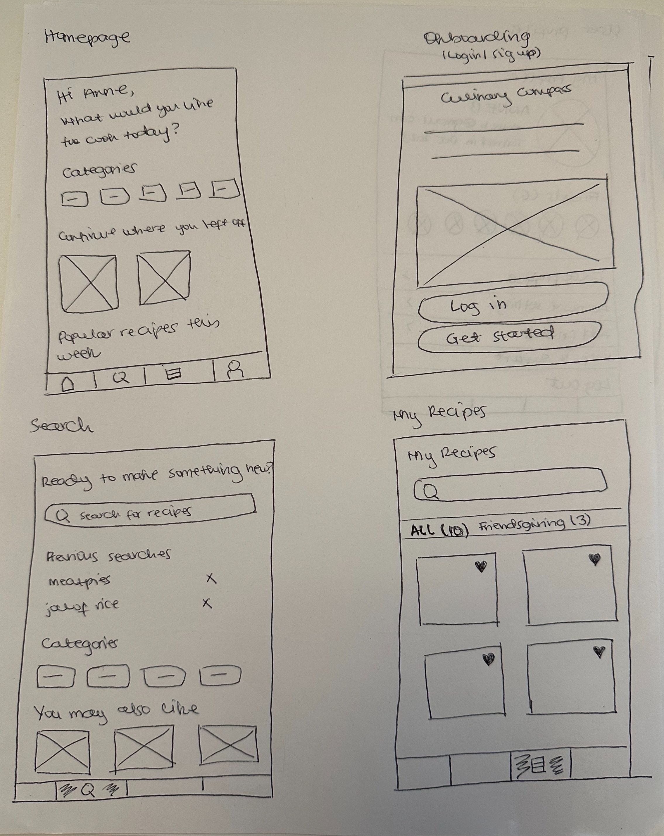
Paper Wireframes
After going through the rough sketches, I identified some solutions I wanted to include in my app and translated these ideas into paper wireframes. While sketching out the paper wireframes, I decided on the main screens in the user flow and what information they would contain.
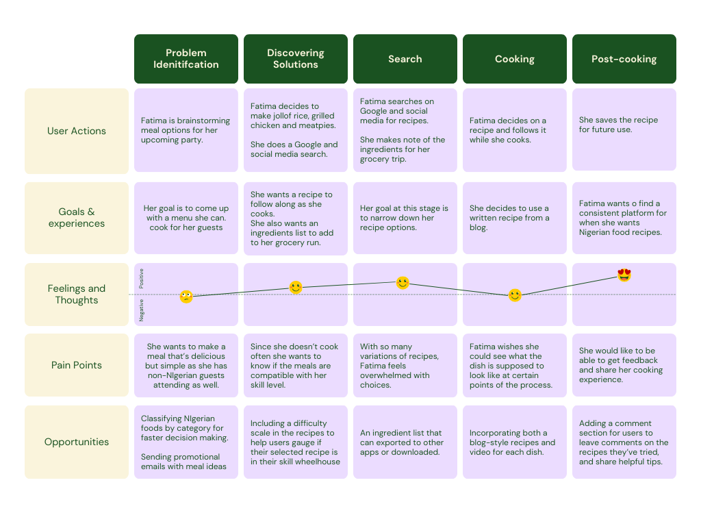
Fatima’s user journey map takes us through the actions, goals, feelings and pain points she experiences when trying to prepare a Nigerian food menu for an upcoming dinner party. In the opportunities section, I have included some areas of opportunity for the Culinary Compass app to address some of her pain points and provide and more positive user experience overall.
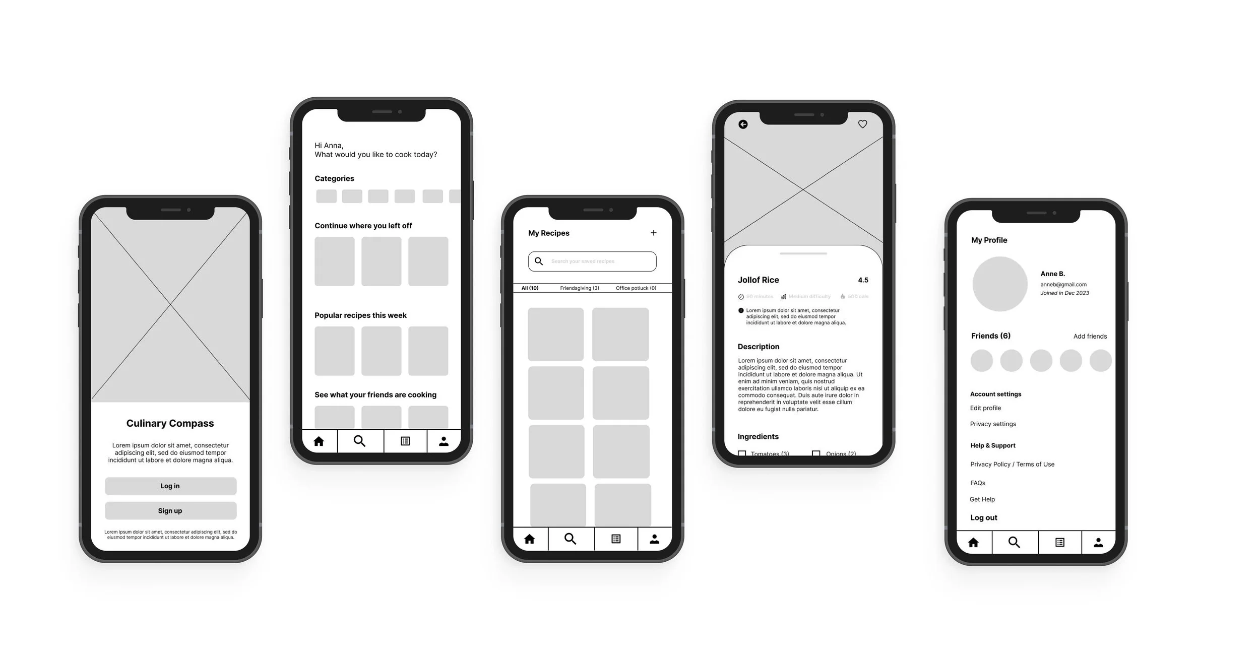
Low Fidelity Wireframes
Creating the low-fidelity wireframes was one of my favorite parts of this project. After all the planning, it was fun putting all the pieces together without thinking of all the technicalities of color, typography, icons, and images. I identified the main screens and began creating the headlines for them.
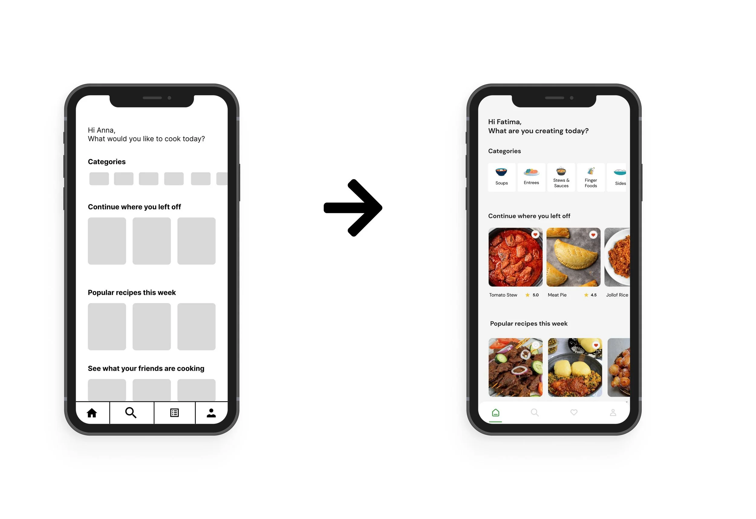
Design Iterations
1. Compelling headlines
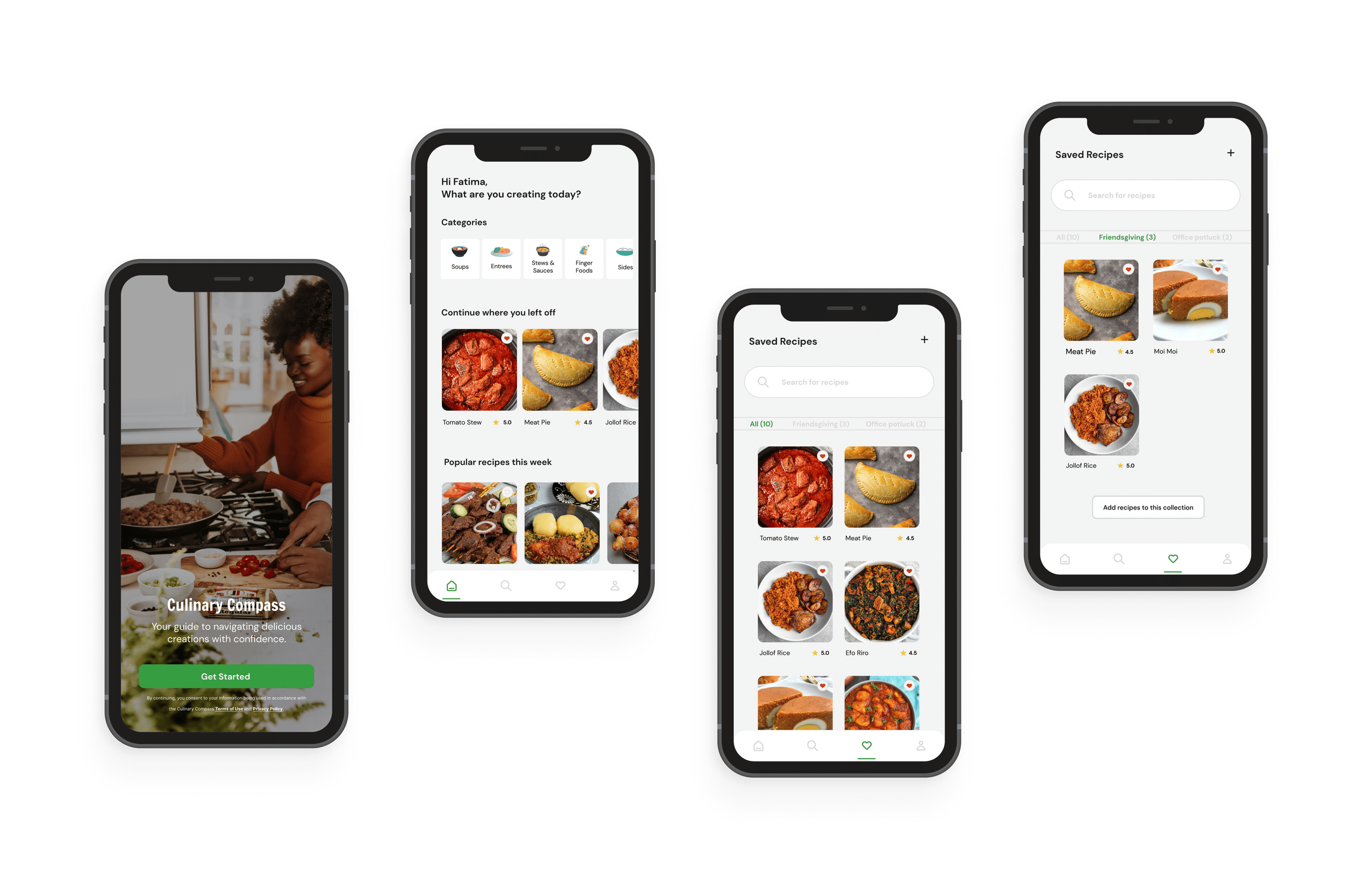
I changed the headline of the homepage from “What would you like to cook today?” to “What are you creating today?” to put more agency in the hands of the users. This change moves the emphasis from just cooking to the idea of creating a new experience.
2. How meals are categorized
I added more detail to the category cards, grouping the foods by Soups, Entrees, Stews and Sauces, Finger Foods and Sides. This will make it easier for users to find foods by type.
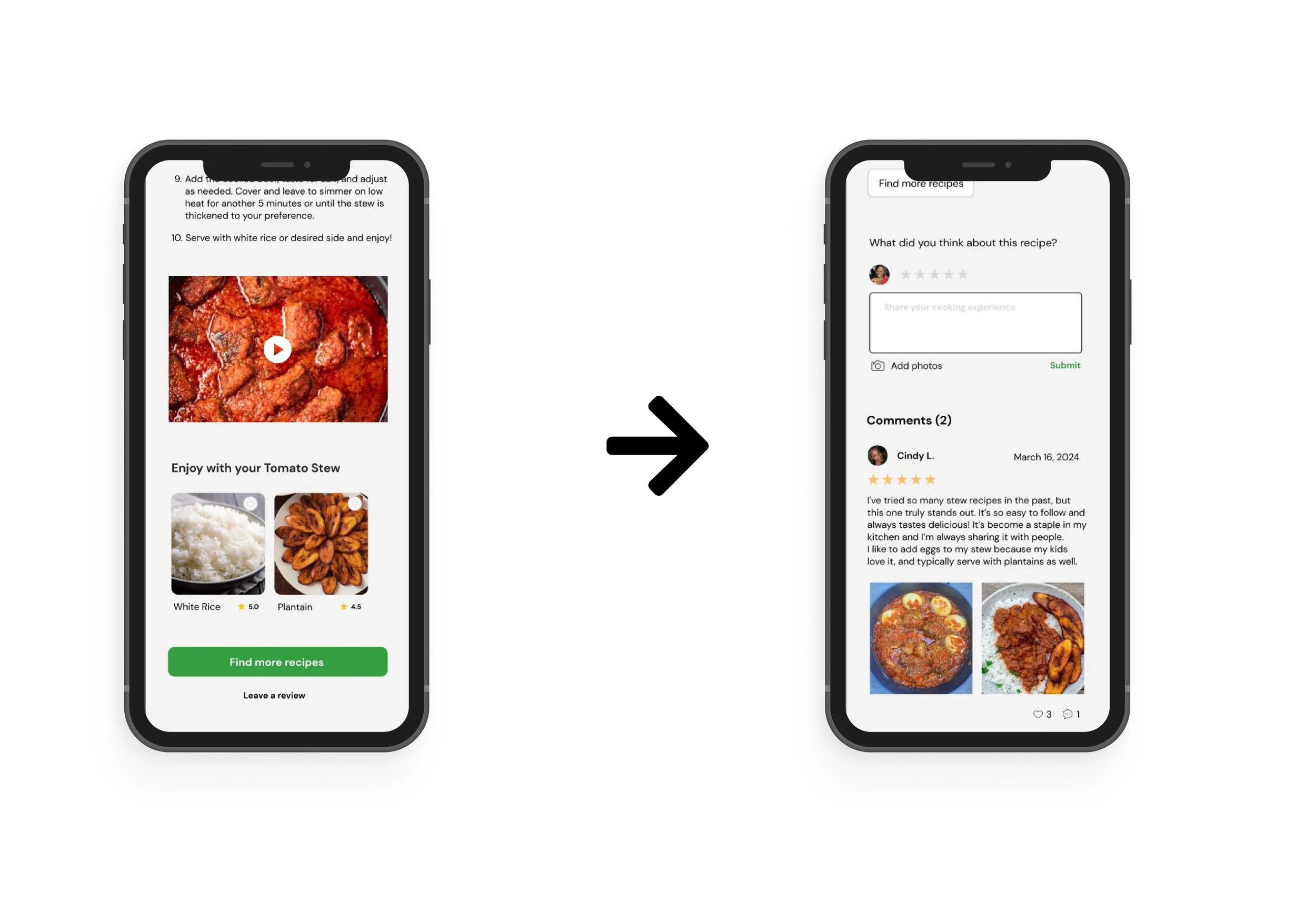
3. Comment section for user feedback
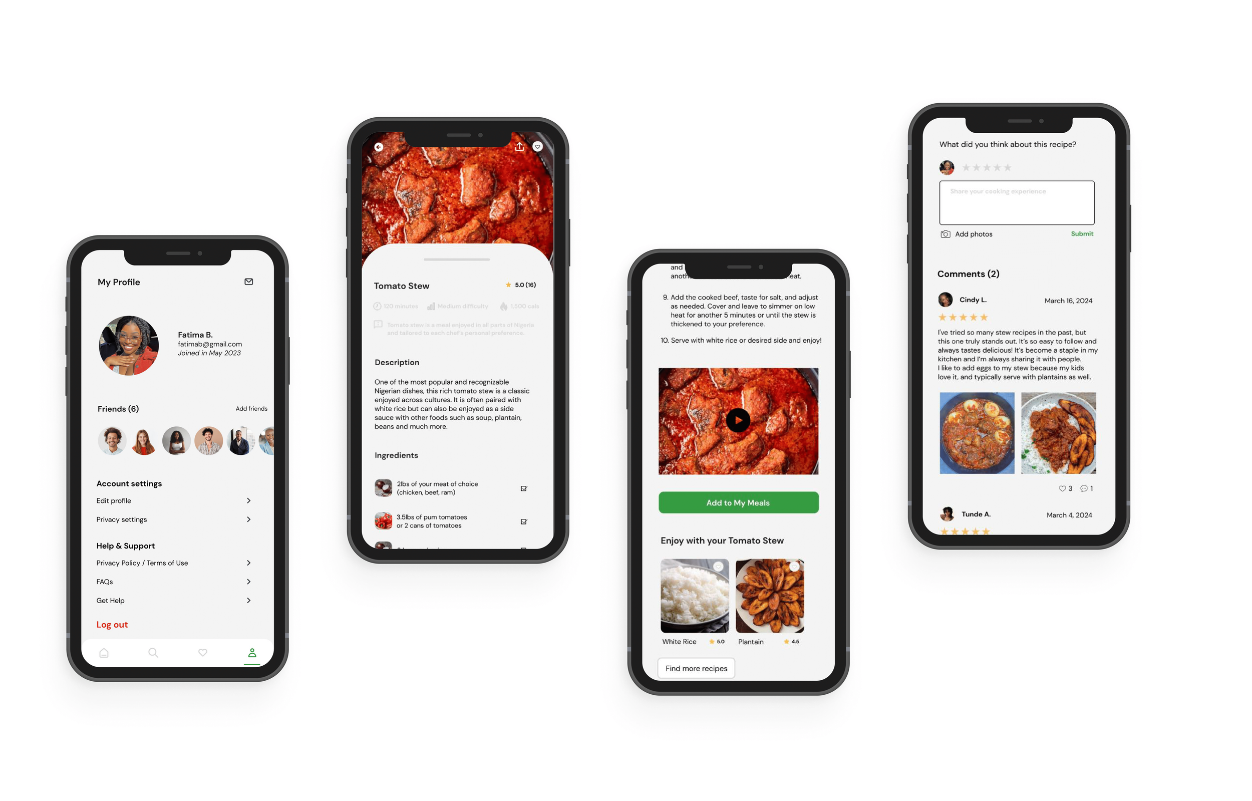
Adding a comment section to share and provide feedback on recipes allows users to engage with each other and provides further opportunities to build connections and gain more cooking tips.
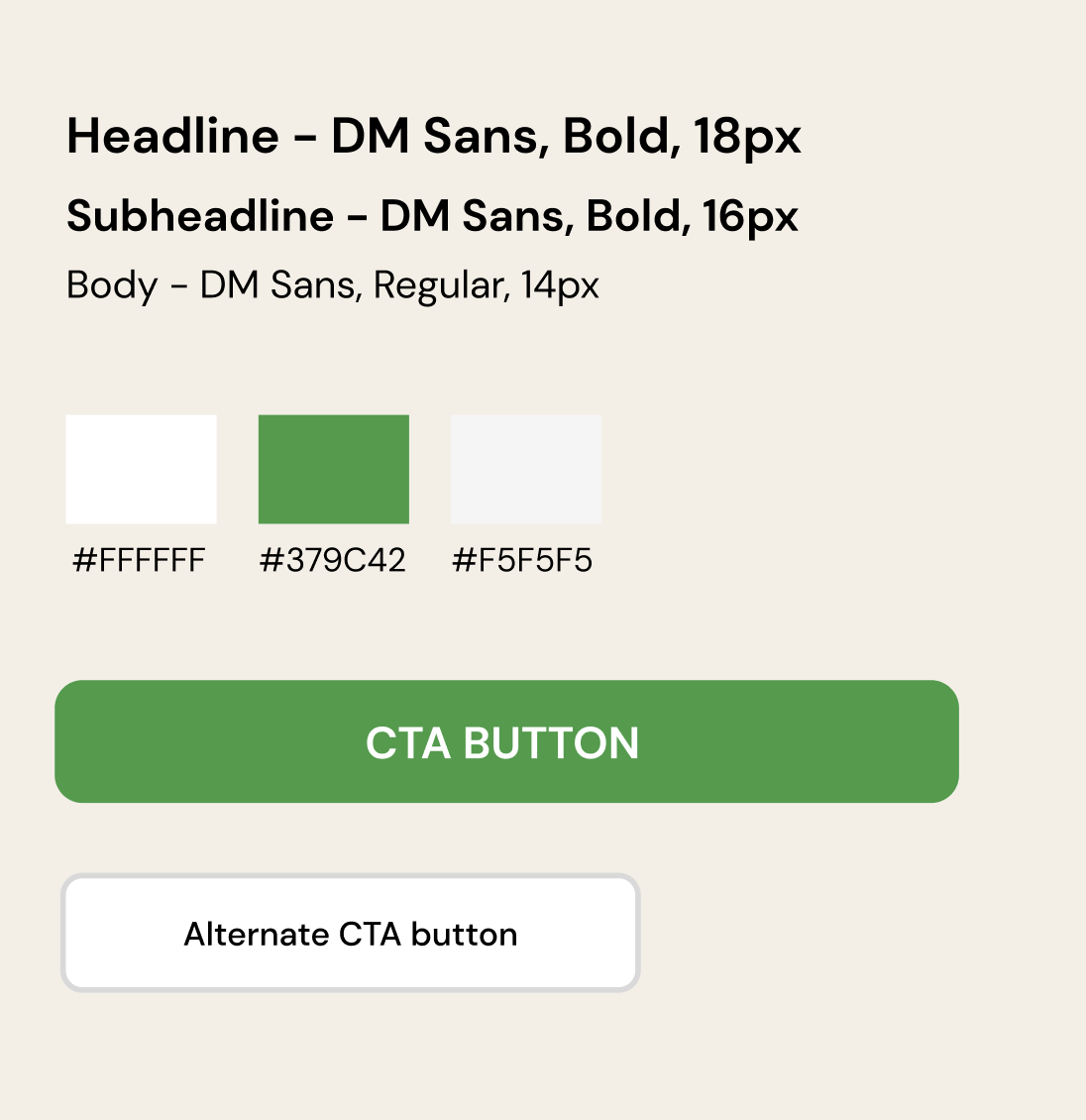
Design System
Final Designs
Conclusion & Reflections
Working on this project was fun and challenging at times. It was great getting to explore the different features I could include in this app to meet users needs but it would have been great to work with a team to brainstorm ideas with. Because this project was done as a part of a design certificate I worked on it alone. Here are a few things I learned in the process:
Empathizing with your users is the key to creating a usable product. Because this product filled a gap in my personal life I was able to connect further with users since I understood their struggles and could translate this into an enjoyable user experience.
Iterations make your product better. Throughout the iteration process, I was able to include additional features that addressed the user needs discovered in the research phase. Even after completing this, I know this product can still go through several rounds of iteration to continue to make it better for users.
Keep it clean and simple with designs. I enjoyed how the visual aspect of the app came out because of how clean and simple I kept it with the colors and designs, instead focusing on other elements like contrast and typography to shine. This produced an app I believe users in various age groups can comfortably use and enjoy.